|
Interactive Atlas of Heart Disease and Stroke. (n.d.). Retrieved April 26, 2017, from https://nccd.cdc.gov/DHDSPAtlas/Reports.aspx
|
|
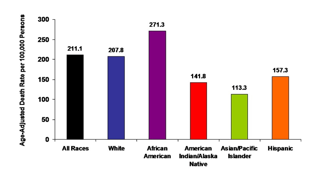
This chart shows the mortality rate per 100,000 people. As you can see, the average death rate of all people is 211,000, With the highest death rate being in African- Americans and the lower death rate in Asian/ Pacific Islander
-Jaila H.
|
The following map represents the mortality rate of citizens in the united states due to heart disease. As can be seen, the lower right hand portion of the U.S. is most affected by heart disease. The map is a slideshow consisting of 8 slides. These slides represent the United states and the death rate due to heart disease per 100,000. The slides are a timeline that will start from 2005 and end at 2014. In this way, how heart disease has progressed can be seen. You can also compare the years and see the differences.
~ Nadir T. |
